• OK, it's on.
  • Please note that many, many Email Addresses used for spam, are not accepted at registration. Select a respectable Free email.
  • Done now. Domine miserere nobis.

cool cover or not?

like it?

  • yes

    Votes: 1 14.3%
  • no

    Votes: 6 85.7%

  • Total voters
    7

TheManBeyond

Banned
Local time
Today 12:29 AM
Joined
Apr 19, 2014
Messages
2,850
-->
Location
Objects in the mirror might look closer than they
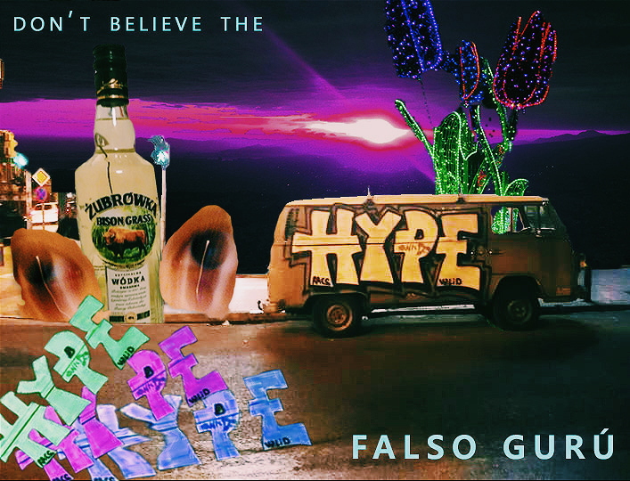
I have been showing it to friends anf everyone is like you can do better, i don't like it, too disorganized, etc. For me i thought the mess in it is meaningfull and describes perfectly the mess the mood and style of my music in it. The meaning is also in every element present on the pic and their combination, the title is also related to them.
I could explain you but maybe you should try to interpret it by yourselves. Or just let the image strike your senses in a way. I admit i'm not totally happy about the text but i don't give a fuck.
I understand how little professional it is and this adds as a con for more elegant, hipsterish or just accomodated minds.
But i will make an alternative cover, trying to be more minimalistic and smooth. Maybe i will just play with shapes.

gyw4gPk.jpg


To check how it goes along the music:


For sone reason soundcloud is so shitty, fuck them 10x
 

Tannhauser

angry insecure male
Local time
Today 1:29 AM
Joined
Jul 18, 2015
Messages
1,462
-->
You're gonna be sued for using that liquor brand in it though.
 

The Gopher

President
Local time
Today 9:29 AM
Joined
Aug 26, 2010
Messages
4,671
-->
I don't know about the music but you can do "mess" better, anything better for that matter. However if it's exactly what your artistic integrity thinks is best for the music then go ahead. Just don't get caught up in ego, it's possible if you listen to feedback you or they will come up with something that fits even better. A great fan may be your idea for the best cooling but if you discover/invent an air-conditioner your opinion may change.
 
Local time
Today 12:29 AM
Joined
Feb 8, 2015
Messages
1,532
-->
Location
the Purgatory
looks like a forced mess
Hmm I think it would look a lot better if u remove the bulky hypex3 text bottom left
 

Brontosaurie

Banned
Local time
Today 1:29 AM
Joined
Dec 4, 2010
Messages
5,646
-->
I'd crop it to the rightmost square, remove the stuff spilling over from the discarded left bit (keeping only the background, the car and the weird neon flowers (love those right there btw)) and change the title to something like "LEAVE THE HYPE". That would be a clearer, more pleasant and memorable image while retaining quirk.
 

Urakro

~
Local time
Today 12:29 AM
Joined
Sep 7, 2015
Messages
466
-->
My eyes follow the words, so they start off at the top-left and move across the top line: "Don't believe the....". From there, I'm not sure where to go. Instinctively, I start back and at the middle where I read the bottle, "Zubrowka". Not really dwelling on it, but for a split second, I know I did something wrong, as the message "Don't believe the Zubrowka" completes the sentence, but has absolutely no significance to it unless I really wanted to be imaginative. Let's start again.

"Don't believe the HYPE". Darting over to the van, I get a fun vibe from it. It now seems like I got the intended message. Then, woop, I'm drawn to those fancy, detailed flowers right up to the top and off the graphic.

K, there's more to this than that. Avoiding the top 2 thirds of the cover, I now come in from the bottom left which carries me in like a rowdy crowd, yelling "hype! hype! hype!. They throw me back in the picture, where I awkwardly just sit, indecisive of where to explore next.

Is that just me, or does that bottle have a hidden subliminal message?

Toggling my pattern interpolater on, I notice that the top and the bottom have the same font. Perhaps, the message skips past the middle, and continues to read "Don't believe the falso guru".

It's interesting, yet just needs a bit more direction and focus. It seems chaotic (which is good), but unsafe. Let people buckle in and guide them through the chaos.

EDIT: (You're the artist, so I really hate doing this) There is a small quick fix you could do. Put all the detailed objects together in one place (like, make a bouquet) The van being in the most foreground, the big bottle plant and fancy flowers together peeking just behind the van in middle ground, (hide the zubrowka label) and the city far off in the background. Be sure to put emphasis on the word "HYPE" on the van (either by lowering saturation of the middle ground(s), or complimenting with a contrasting colour on hype), and lessen the impact of the 3 shout hypes (Perhaps, add them with the bouquet) This would bring together a single, impressionable 'thing' that the person can focus on. Then optionally, the false guru signature being just a tad more out of the way at the bottom.
 

Sly-fy

Active Member
Local time
Today 9:29 AM
Joined
Feb 15, 2016
Messages
360
-->
Location
suspended animation
Like others have said, no brand placements. It looks like either a Vodka commercial, or a poster for a summer music festival that`s sponsored by a vodka brand. My brain`s unsure of what to focus my eyes on, but if that`s what you were going for then you`ve succeeded. Other than that I like it, for what that`s worth since this isn`t my expertise.

Still it wouldn`t hurt to try making an alternative cover and weighing that one against this one. Like you`ve said, the other one should ideally offer some contrast to this one in terms of going toward minimalism.
 

TheManBeyond

Banned
Local time
Today 12:29 AM
Joined
Apr 19, 2014
Messages
2,850
-->
Location
Objects in the mirror might look closer than they
Ok, imma explain it a bit now.

The zubrufka bottle: i went to polland thanks to a new really good friend i met while i was in athens, i spent christmas there. we bought that bottle to celebrate when we come back to athens. So we arrived and filled a little flask i got as a present and while partying in new years eve this girl who's kinda with me (real long distance relationship thread for more info) stole it from me, then gave it back with no zubrowska inside only apparently "cheap vodka" that tasted like hugo boss parfume. I thought it was badass.

Eyes: i took this picture of myself in room while i was stoned or something. the camera moved and left this cool effect.

Neon flowers: weird illuminated garden in warsaw. tons of light everywhere, really fancy shit. Somehow this music is a romantic gift from me to everyone as are experiences like that one to me. This is a feedback. Enlightened.

Van: The fun trip. i found this on my last night in athens, reminds me a lot of a couple of guys i met there who were into skying, surfing and stuff, i learnt some of these things with them althought i was utterly bad at it. It gives me an i see no consecuences vibe. I took the pic and another friend of mine and me were discussing about how to name my demotape and he said call it don't believe the hype. I thought it was perfect.
He was meaning it as our scholarship in that crazy city wasn't as remarkable and inspiring as everyone usually says about this program. I disagree with him. For me it was a really uprising experience. But i still like the meaning behind from my pov.

Sunset from likavetos hill: romantic stuff. that sun with that cloudy sky over athens was a pic i sent to this girl when she left, i told her, my sun left athens. It was like first day of clouds in weeks. I know, sweet romantic bullshit. xD but it looks like it's watching me, it's like an eye. somehow.

Here's the demotape, still need to finish like 3-4 songs more and add them and re record vocals for putrefacción. Damn i'm so lazy for this shit.

https://soundcloud.com/atrasalviejo56/sets/dont-believe-the-hype-demotape
 

QuickTwist

Spiritual "Woo"
Local time
Yesterday 6:29 PM
Joined
Jan 24, 2013
Messages
7,182
-->
Location
...
Its kinda lacking a central focus. There is a lot going on in this cover and I think it will really only appeal to a certain crowd. If that's what you're going for then I think it will work. just my 02.
 

TheManBeyond

Banned
Local time
Today 12:29 AM
Joined
Apr 19, 2014
Messages
2,850
-->
Location
Objects in the mirror might look closer than they
can't believe how bad rates this art got, i just updated it for uploading to bandcamp

here are the results:

[BIMG]http://i.imgur.com/kVVOrgT.jpg[/BIMG]

seems it lose some quality somewhere in the process but i don't have the goddamn original images, they are on my broken phone which won't turn on.
 

Puffy

"Wtf even was that"
Local time
Today 12:29 AM
Joined
Nov 7, 2009
Messages
3,484
-->
Location
Wanking (look Mum, no hands!)
It sounds like all of the images have personal meaning to you. It's disorganised to everyone else as the images appear placed together without any context or means of interpreting them, as we lack your personal lens. Art is a form of communication. If the meaning is entirely private, little is being communicated.
 

redbaron

irony based lifeform
Local time
Today 9:29 AM
Joined
Jun 10, 2012
Messages
7,253
-->
Location
69S 69E
+1 for Zubrowska vodka
-5 for the kitschy HYPE HYPE HYPE in the bottom left

imo the van is enough, and the images themselves are so interesting that these big bright letters distract from the actual interesting aspects of the picture. the roses, the van and the vague impressions of the cityscape behind a vodka bottle
 

redbaron

irony based lifeform
Local time
Today 9:29 AM
Joined
Jun 10, 2012
Messages
7,253
-->
Location
69S 69E
i also think the bottle should be broken and emptying its contents into the sewer, for maximum EDGE
 

TheManBeyond

Banned
Local time
Today 12:29 AM
Joined
Apr 19, 2014
Messages
2,850
-->
Location
Objects in the mirror might look closer than they
haha, i still have one full bottle of zubrowska in my room which was a gift of my polish friend, i won't drink it tho, maybe before i die, in case i know i'm going to

i mean, i think the cover is really unique and attractive in its way, u know it's there, it might be next to trhiller by michael jackson or nevermind by nirvana and you will still see the hype thing and get that wtf. sure it is not minimalistic but i'm in a crusade against that movement.
it's a big step for marketing guys.
u intps need more vision.
design is not what design is supposed to mean, or encompass.
 
Top Bottom